
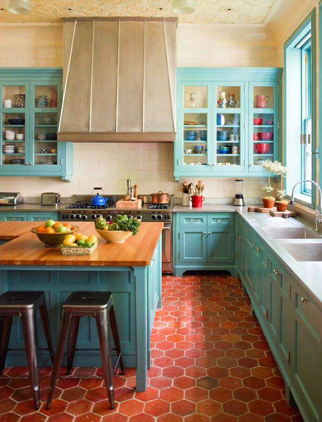
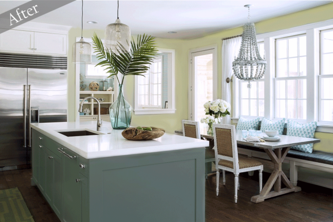
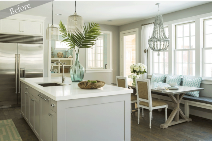
Out with the white in with the… blue? Colored kitchen cabinets are back in a bold way! With an influx of new color schemes from last year, homeowners, and designers alike are taking the plunge and are incorporating color into the mix. Although, many still grow weary at the sound of “painted cabinets”, what’s trending for 2015 is far from the colored cabinets of yesteryear. Considerably diverse from your mother’s kitchen, this year’s kitchen cabinet color trends are sure to add timeless character.
That being said let’s begin with answering a few of your questions regarding colored cabinets:
“ When is a good time to incorporate colored cabinets into my kitchen? I like the design I have now and don’t want a complete remodel.”
-
Now is a great time! If you have had the same kitchen design for years and have grown fond of it, painted cabinets is the ideal option for you. Not to mention it is one of the most cost effective ways to achieve the revamp you are craving without the financial strain of a complete remodel.
“ What if I’m not sold on the whole ‘“color trend”? What are my alternatives to traditional white cabinets then?”
-
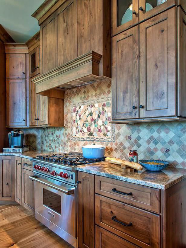
There are many alternative options to committing to the bold statement that painted cabinets can sometimes make. If you’re looking for a more subdued yet updated look for your kitchen there are various wood stains that can add the right amount of style for your taste. Your design options for staining are not limited in the least, as shown below, staining can be done to achieve anything from a clean contemporary look to a rustic weathered finish. In addition staining can add color to your cabinets while keeping the appeal and integrity of the wood.
“I am remodeling, first time homeowner, and I am ready to make some bold color statements with my cabinets! How do I know I won’t get tired of the color I pick?”
-
The short answer is there is no guarantee that in ten + years you won’t your won’t change your mind. However, that being said there are are a few simple steps you can take while choosing your color scheme to ensure you’re creating a look that is timeless rather than temporary.
-
Step 1. Do your research! Don’t pick the first color scheme you see. Take your time, find various color schemes that spark your interest and narrow it down from there. Visit sites like pinterest and houzz to get design ideas.
-
Step 2. Pick a color scheme that you feel most at home with. Often times, clients of mine get excited with bold hues and statements they see in shows like HGTV and in plush interior design magazines, that when translated into their home has them second guessing their decision. Make sure its a color YOU can live with not just a color you like the idea of.
-
Step 3. Professional designer’s are your design guru’s use them! Chances are if your designer has been in the industry as long as I have, they have seen it all! After narrowing down your choices consult your designer and work together to create the perfect medium of aesthetic appeal and functionality, that will keep your kitchen trendy and timeless.
Stains & Glazes
Stain Vs Glaze
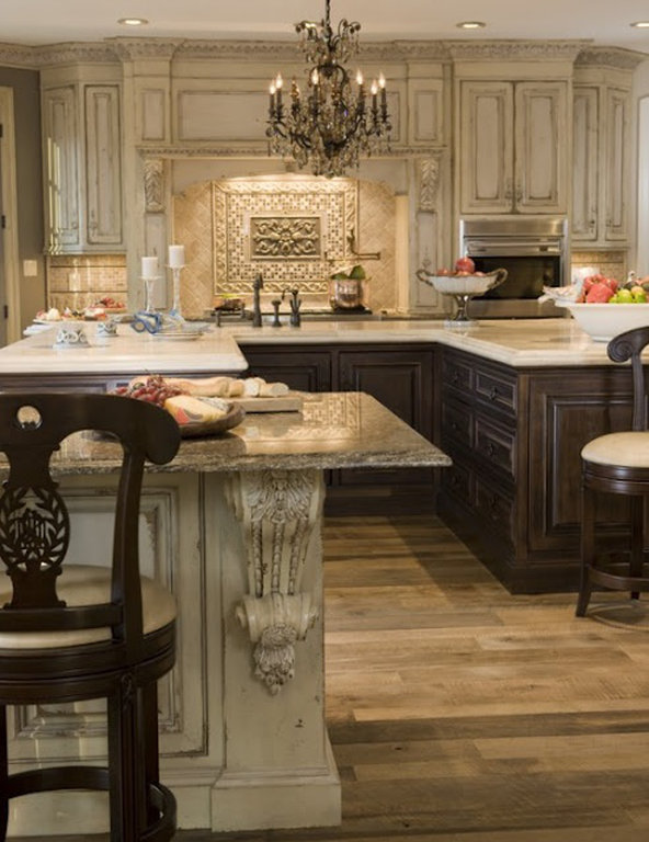
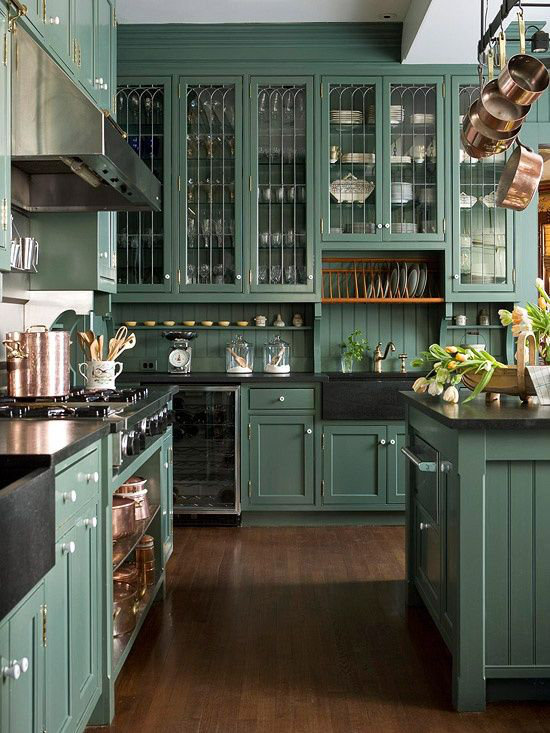
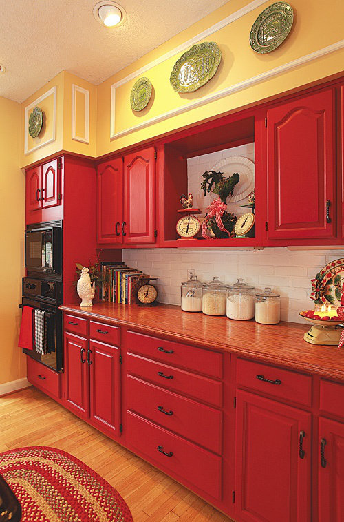
Colorful Kitchens:

Comment below! I’d love to hear your thoughts on colored kitchens.
Love it? Hate it?

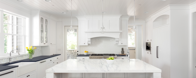
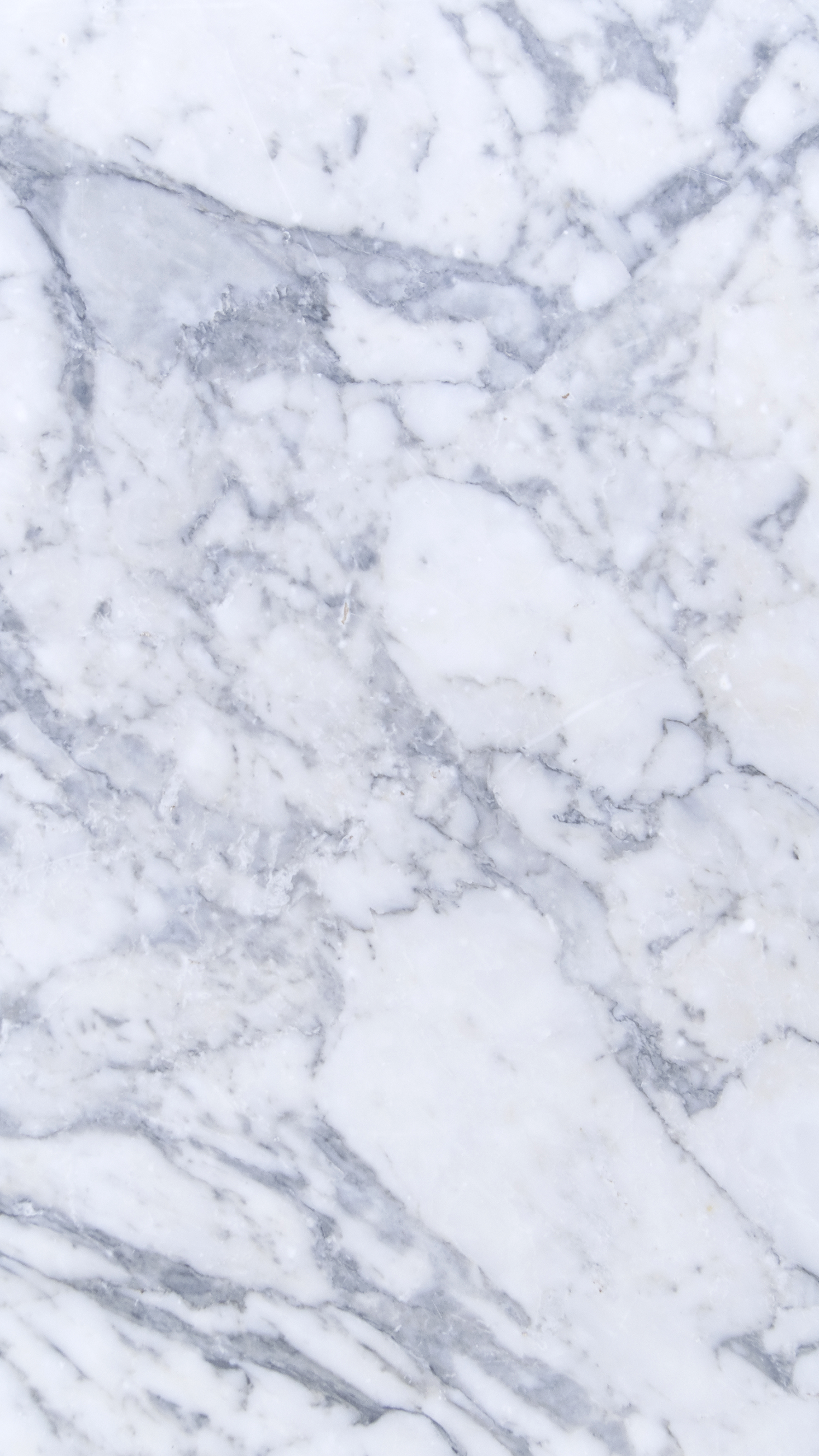
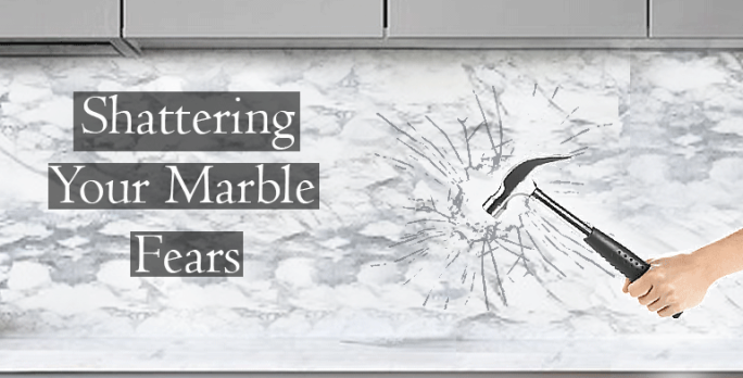 This very question is one that designers, contractors, and homeowners mule over when deciding whether or not to use the timeless beauty that is marble. Marble has been used for centuries as the medium for many historically renowned art pieces. But does it translate as gracefully into ones home, seems to be the hot topic of debate. The answer to that varies from person to person. The decision to choose marble over other natural stones center’s around the individuals lifestyle rather than personal taste. For example as a homeowner you could love the idea of marble but end up resenting the upkeep that it requires. On the other hand you could enjoy the aging process that gives marble its distinguished character. In order to best inform you and answer all your must-know’s about marble I have broken a large quantity of information into a quick reference.